Every overnight success has a backstory—and more often than not, the first chapter is written in color swatches, kerning tweaks, and a bold logo that refuses to be ignored. Below are seven brand design examples that catapulted obscure startups into household names. Steal the frameworks, remix the tactics, and write your own crowning moment.
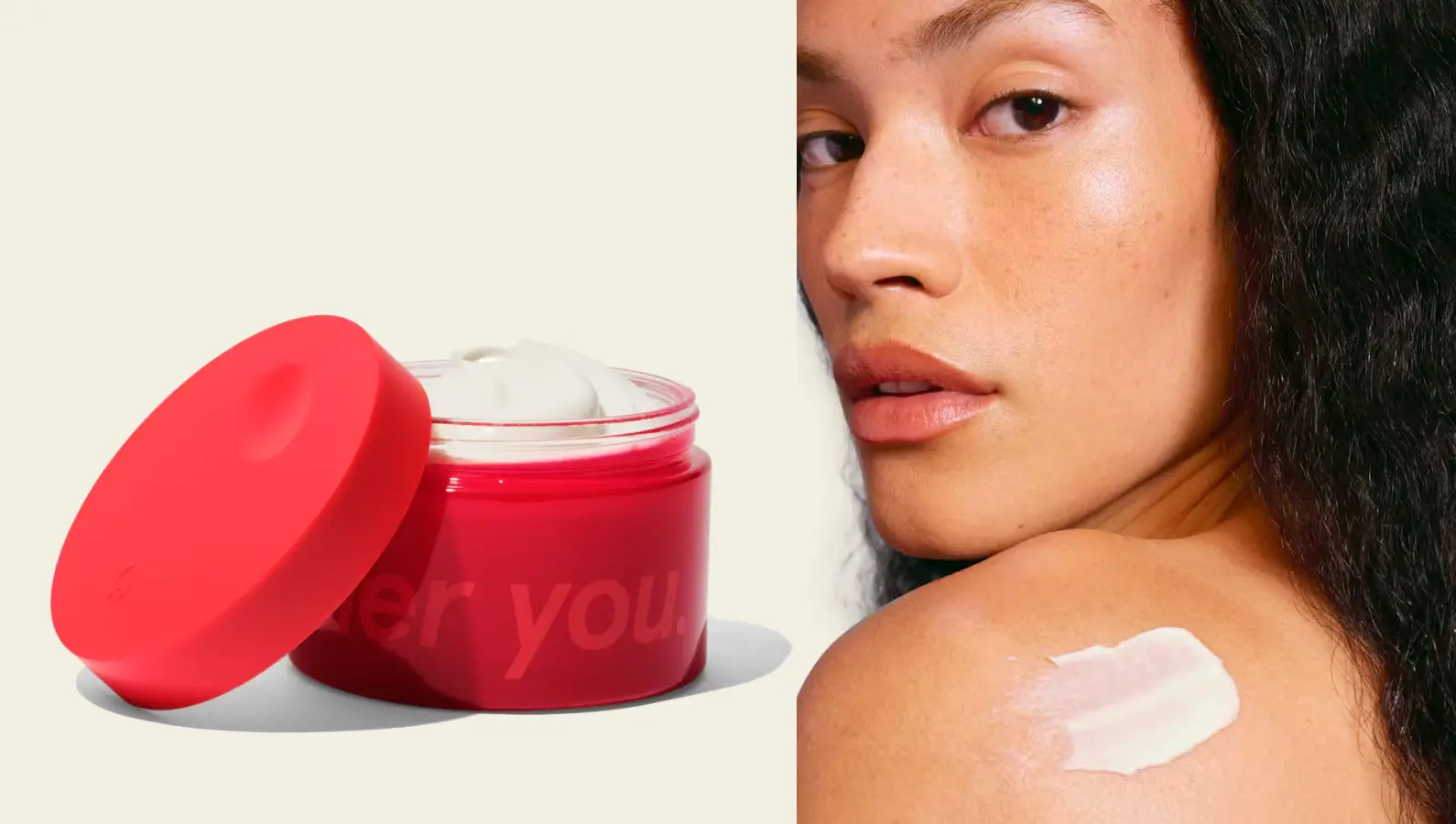
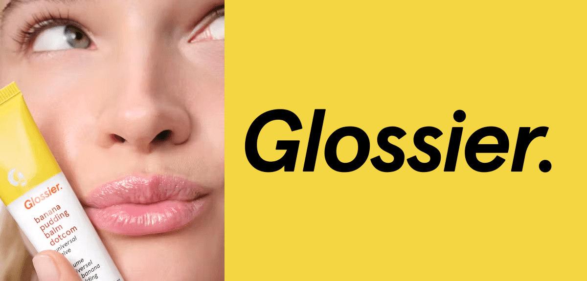
1. Glossier – Minimalism as a Status Symbol
 From:
From: Beauty-blog side hustle
To: $1.8 B cult favorite
The Brand Design Move
Glossier stripped beauty retail down to a pastel palette, sans-serif wordmark, and millennial-pink canvas bags that doubled as Instagram bait. By treating packaging as content, they turned every unboxing into free UGC.
Framework to Steal
-
Single Signature Color – own one hue so hard it becomes shorthand for the category.
-
Product-First Packaging – if the box is the billboard, the logo can stay whisper-quiet.
> Takeaway: In saturated markets, restraint screams confidence.
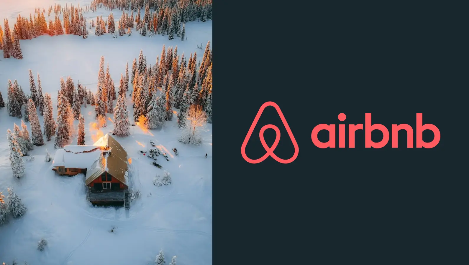
2. Airbnb – A Symbol Belonging Anywhere
 From:
From: Air-mattress rental site
To: Global hospitality titan
The Brand Design Move
The 2014 Bélo symbol fused a heart, a location pin, and an “A” into one loop that travelers wanted to tattoo on their forearms. Overnight, the mark transformed functional transactions into emotional belonging.
Framework to Steal
-
Universal Iconography – mash two universally understood shapes to create a third meaning.
-
Story-Led Rollout – accompany the reveal with a narrative video so the logo lands with context, not confusion.
> Takeaway: A logo isn’t a label; it’s a passport stamp.
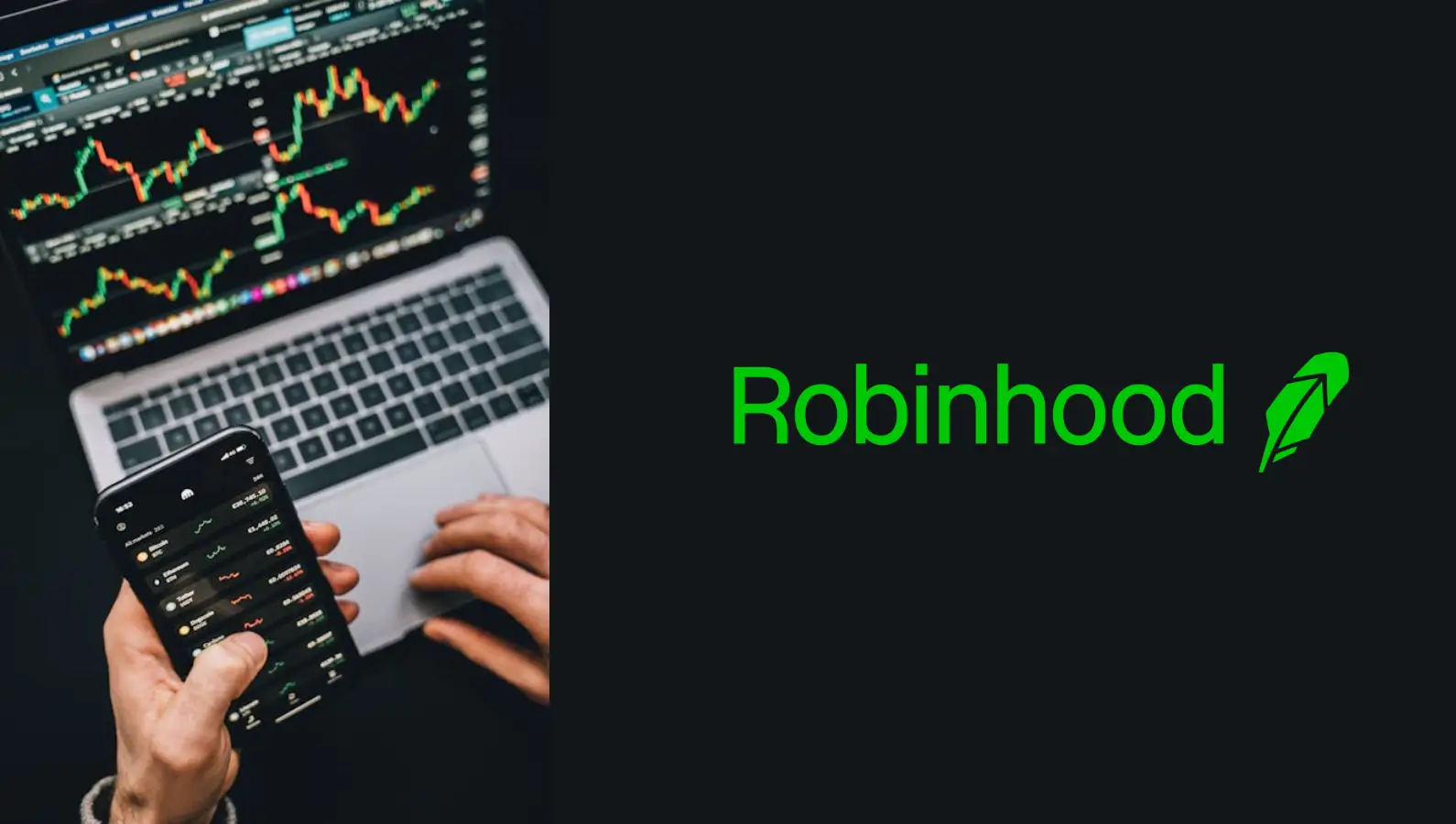
3. Robinhood – Finance in Forest Green
 From:
From: Fintech underdog
To: 22-million-user trading empire
The Brand Design Move
Robinhood ditched Wall-Street navy for a rebellious green, wrapped a feathered hood around the bull, and set the app icon against a jet-black phone screen. The result felt more like a game than a brokerage.
Framework to Steal
- Category Color Inversion – if everyone zigs blue, zag green.
- Gamified UI Cues – subtle motion graphics turn complex data into dopamine hits.
> Takeaway: Democratize the aesthetic, and you democratize the product.
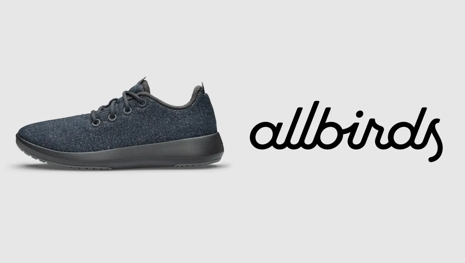
4. Allbirds – Sustainability You Can Smell
 From:
From: Wool sneaker startup
To: Billion-dollar “anti-Nike”
The Brand Design Move
Kiwi sketches, muted earth tones, and hand-drawn typography telegraphed eco-credibility before the word “sustainability” ever appeared. Even the hangtag is sugar-cane paper—proof that materials are messaging.
Framework to Steal
- Tactile Storytelling – let the texture of the packaging reinforce the product promise.
- Mascot with a Mission – a simple kiwi bird became shorthand for planet-first footwear.
> Takeaway: When your values are built-in, the logo just signs the letter.
5. Notion – Lego-Block Branding
 From:
From: Niche productivity app
To: Remote-work operating system
The Brand Design Move
Notion’s block-based interface inspired a visual system of inter-locking shapes and emoji-rich covers. The brand flexes from pastel minimalism to maximalist chaos without ever breaking coherence.
Framework to Steal
- Modular Identity – create a kit-of-parts so users remix your brand for you.
- Emoji as Accent – low-cost, high-emotion micro-assets that scale across cultures.
> Takeaway: Empower users to co-author the visual story, and virality becomes baked-in.
6. Oatly – Oat Milk with Opinions
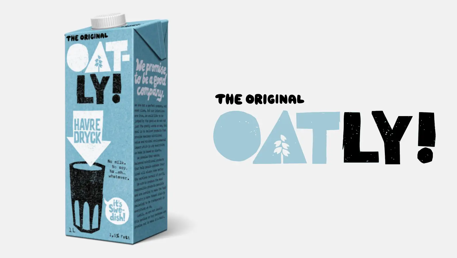 From:
From: Swedish research side-project
To: IPO-ready alt-dairy darling
The Brand Design Move
Hand-scrawled fonts, sarcastic headlines, and billboard-length manifestos turned milk cartons into conversation starters. The brand sounds like your witty barista, not a corporation.
Framework to Steal
- Voice-First Visuals – let typography carry the tone when photography feels too polished.
- Provocative Copy Blocks – replace bullet benefits with narrative rants your audience screenshots.
> Takeaway: When the medium is the message, the logo can literally say “blah blah blah” and still sell.
7. Oura – Wellness as Wearable Jewelry
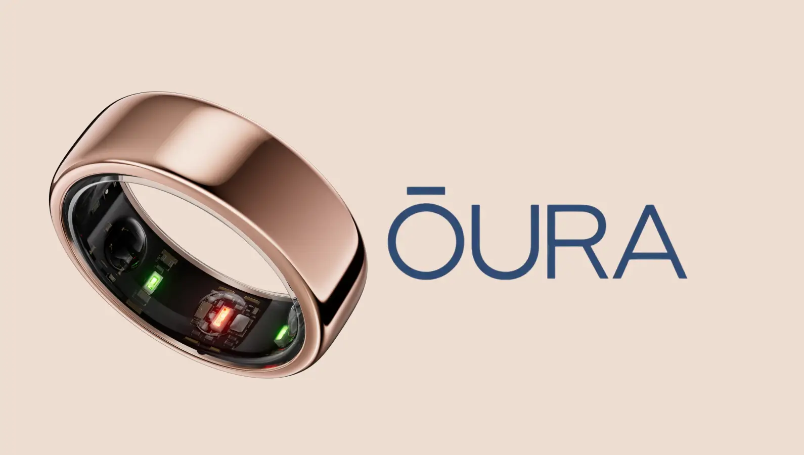 From:
From: Sleep-tracking gadget
To: Health-status flex piece
The Brand Design Move
Matte black, titanium edges, and a barely-there ring icon positioned tech as fashion accessory. The packaging feels like unboxing an iPhone—but for your finger.
Framework to Steal
- Luxury Tech Lexicon – borrow cues from jewelry to elevate utilitarian devices.
- Moody Product Photography – dark gradients and soft light scream premium without words.
> Takeaway: If the product lives on the body, the brand should dress for the occasion.
How to Apply These Brand Design Examples Tomorrow
1. Audit Your Palette – pick one disruptive color and ban the rest for 30 days.
2. Prototype the Unboxing – design the reveal before you design the logo; context beats pixels.
3. Write the Manifesto – 150 words that sound like your brand texting its best friend.
4. User Co-Creation Week – give your community three templates to remix; the best becomes canonical.
5. Measure the Flex – track Instagram saves, TikTok stitches, and Reddit threads that screenshot your visuals.
Final Word
These brand design examples prove that a scrappy startup doesn’t need a Super Bowl ad—just a visual story worth sharing. Your next crown is one color, one curve, or one cheeky tagline away.
Ready to join the list? Let's talk.